Ambika is a journey that blends tradition and modernity, unveiling a haven of Ayurvedic wellness. With a strong commitment to authenticity and well-being, Ambika’s essence shines through its brand identity. From a carefully crafted logo that pays tribute to natural remedies, to a thoughtfully chosen color palette that merges heritage and modernity, Ambika embodies the timeless wisdom of Ayurveda for today. This story celebrates the balance of tradition and innovation, inviting exploration into a realm where “from our home to yours” carries a profound and holistic meaning.
Ambika
From Our Home to Yours
Ambika, a visionary in the realm of holistic wellness, sought to capture the spirit of ancestral remedies through a modern lens. Our client's unwavering commitment to authenticity led them to search for a name that resonates with Indian heritage and family values. The brand’s key philosophy "From our home to yours" became the guiding light and tagline, symbolizing a connection that goes beyond transactions to foster relationships rooted in trust.
Ambika

Crafting Nature's Signature
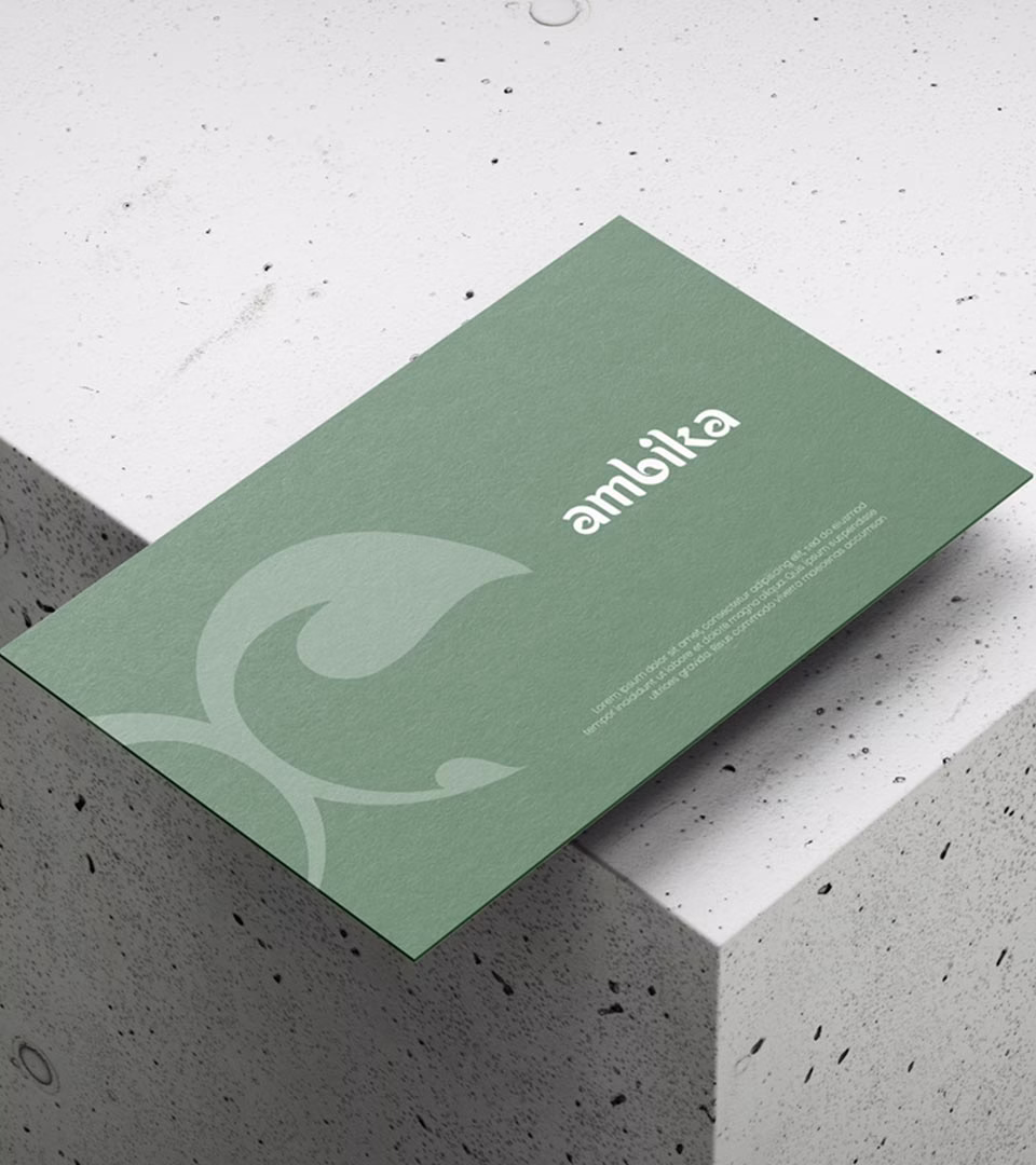
In a seamless blend of nature’s essence and contemporary elegance, Ambika’s logo connects tradition with modern values. Delicate leaf motifs pay homage to natural remedies, while the water droplet signifies purity and rejuvenation, fundamental aspects of Ayurveda.


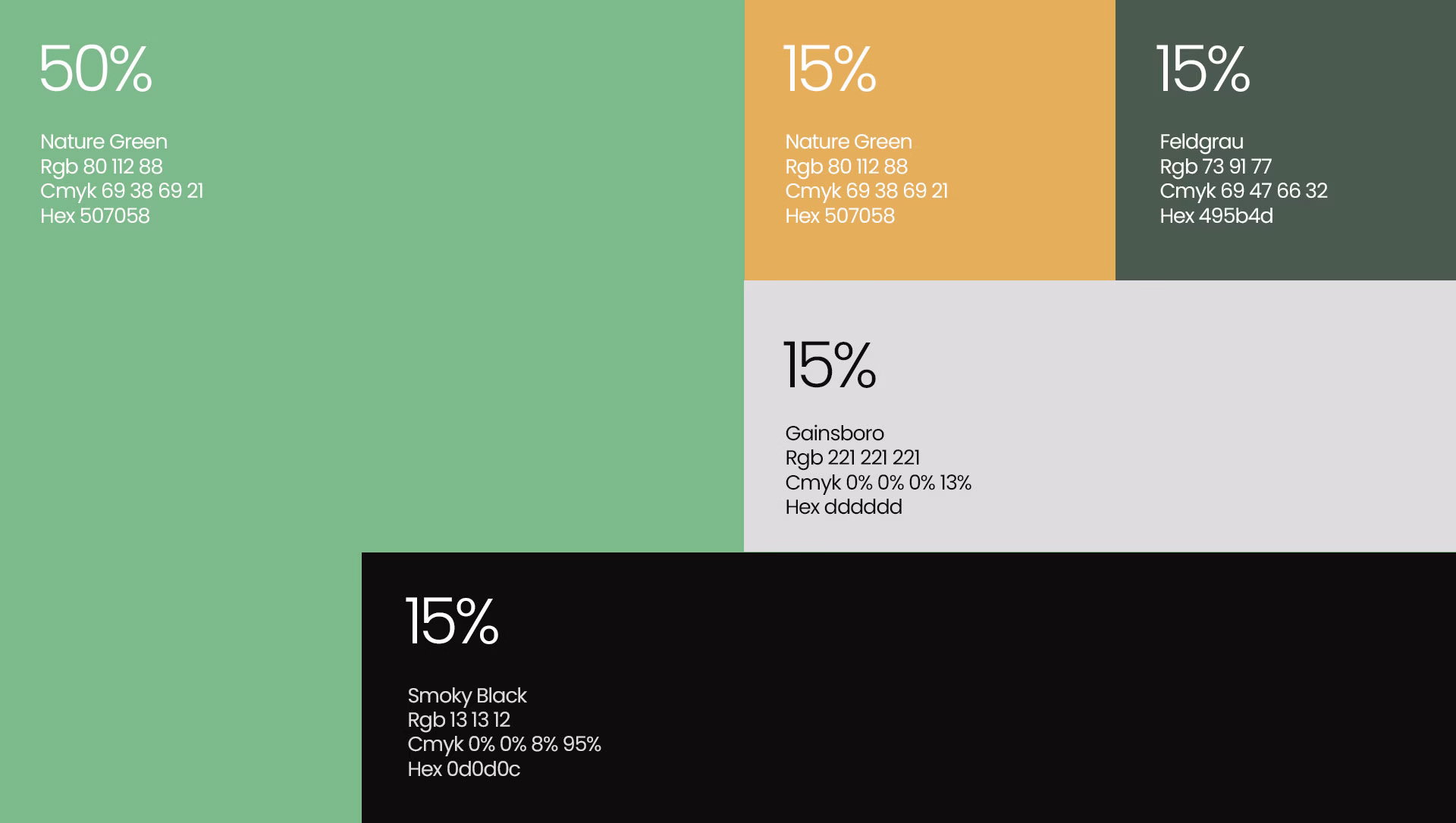
Colors That Breathe Life
Ambika’s color palette embodies its commitment to authenticity and well-being. Natural Green signifies freshness and vitality, while Golden tones exude warmth and trust. Dark Green, nodding to herbal wisdom, effortlessly merges with a touch of sophisticated Mad Black. This harmonious blend reflects Ambika’s heritage and modern approach.
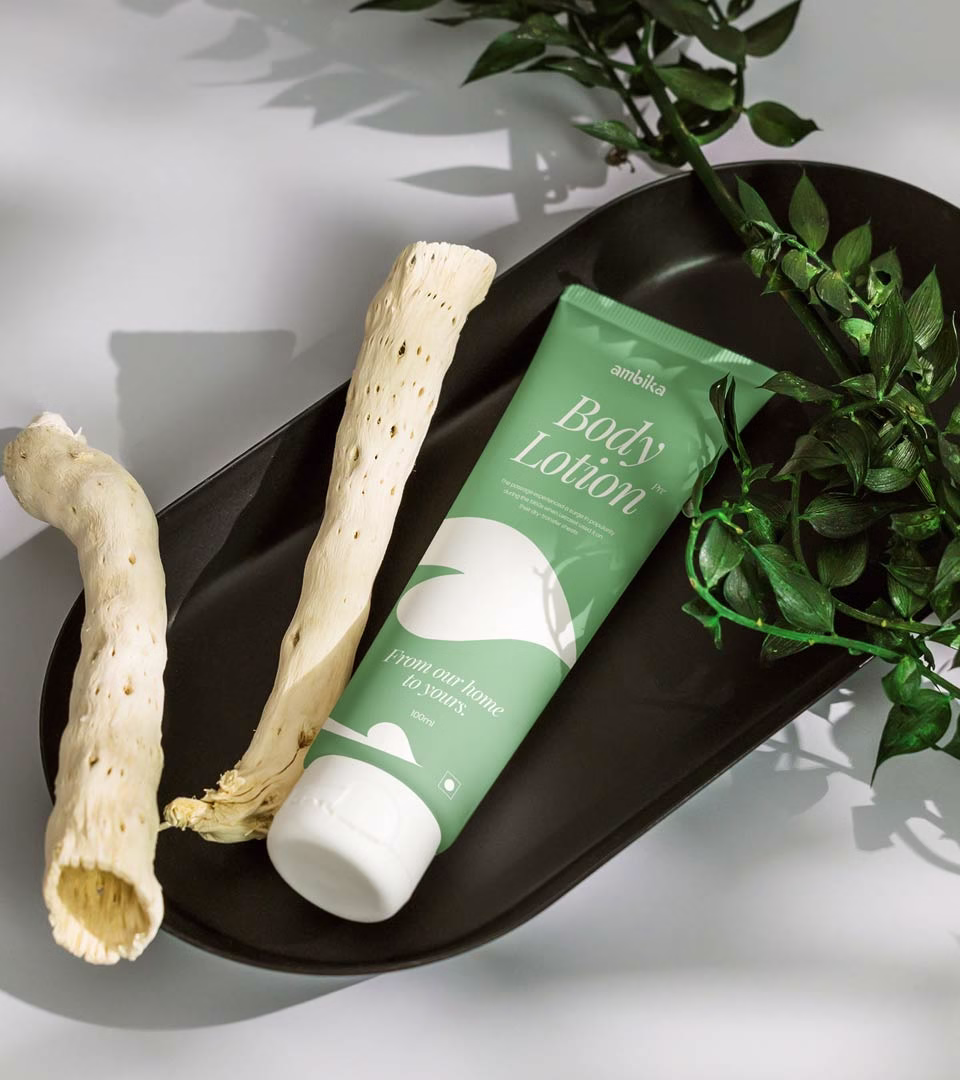
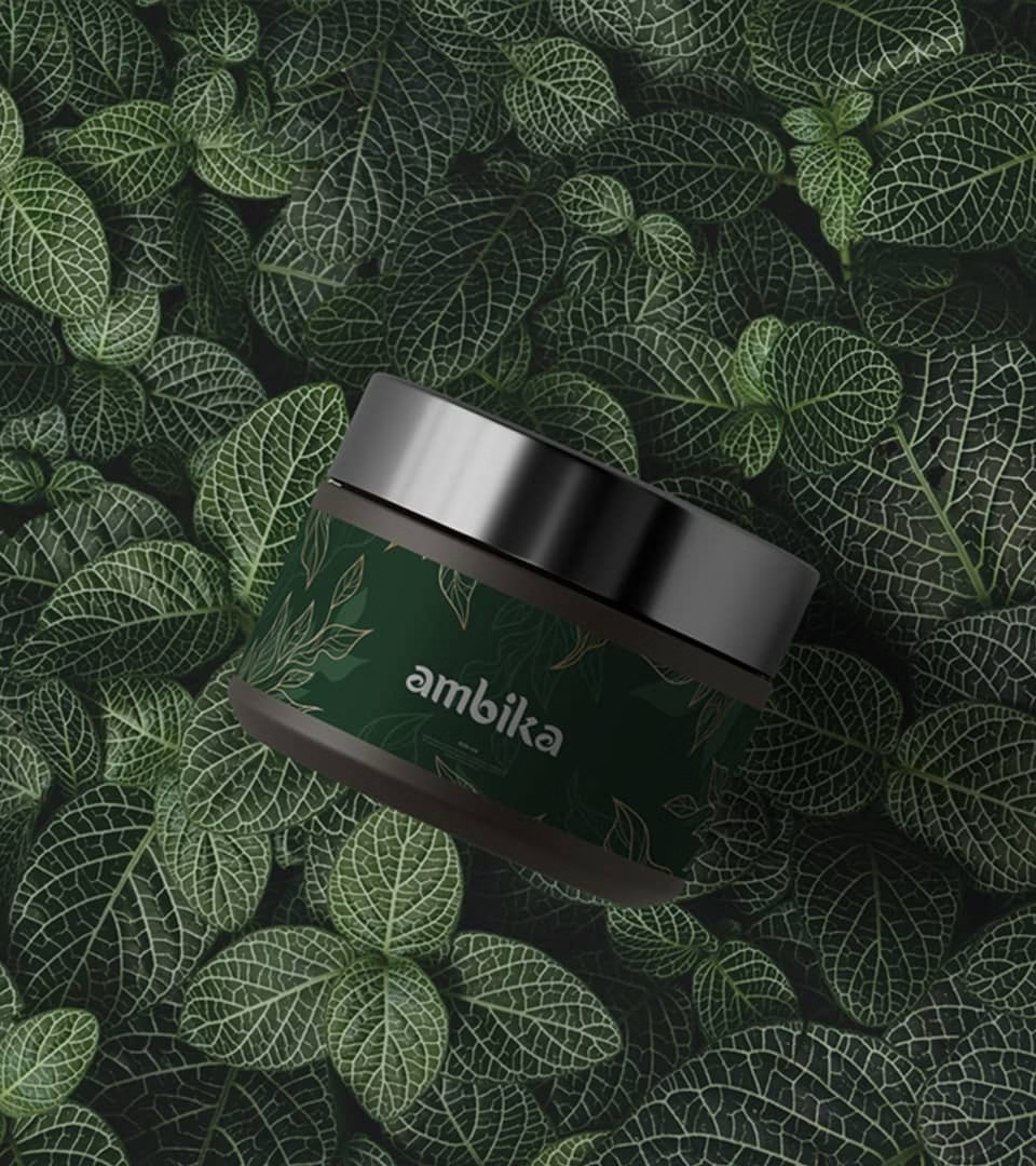
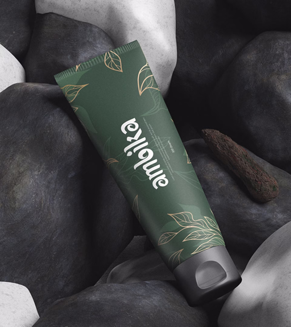
Bridging Vision and Reality
Ambika’s influence extends to various domains. From captivating digital presentations to carefully crafted packaging, each element echoes the brand’s values. The theme converges tradition and innovation, where every detail mirrors Ayurvedic wisdom for the contemporary world.


Bringing the Ayurvedic Heritage to Life
At the core of Ambika’s design lies a dedication to authenticity. The logo’s intricate construction echoes Ayurveda’s essence, a timeless science. Guided by the leaf’s symbolic significance and the purity of a water droplet, we conceived a logo which captures Ambika’s commitment to holistic well-being. This design also evokes a sense of nostalgia and trust, aligning seamlessly with Ambika’s core idea of “from our home to yours.” The choice of the name “Ambika,” a Sanskrit word meaning “Mother,” further infuses the essence of care, love, and unadulterated natural goodness into every product, mirroring a mother’s instinct to provide the best for her children.
Capturing Essence, Inspiring Wellness
Through Ambika’s brand identity, we celebrate the synergy between tradition and modernity. The logo encapsulates Ayurvedic wellness in a modern context. Ambika transcends being a mere brand; it embodies the potential of ancient wisdom reimagined for the modern era.