They provide a convenient booking management system to small businesses, allowing them to level up from traditional booking techniques without excessive development or maintenance costs.
Buktym
That one time when we got buk’d for branding!
To put it simply, Buktym takes small businesses to the digitally savvy consumer.
The Challenge
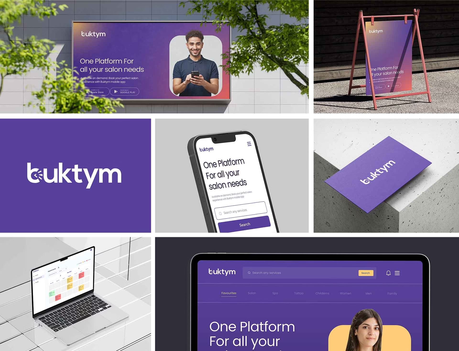
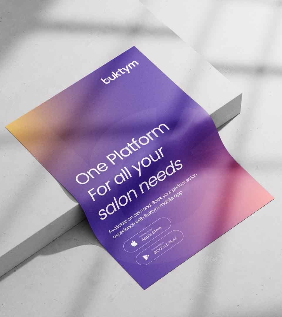
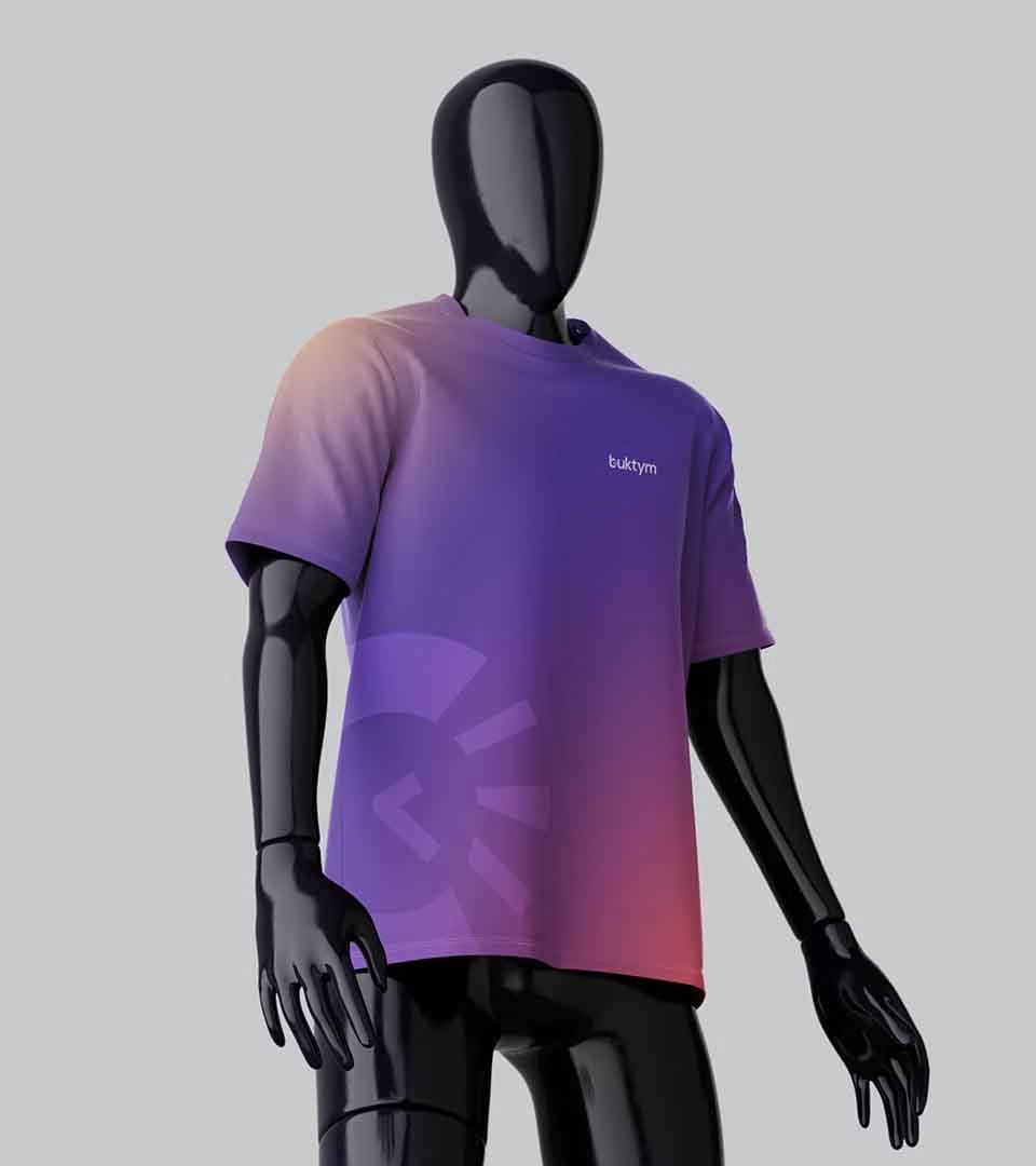
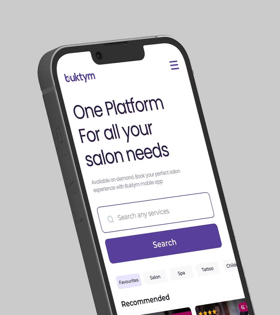
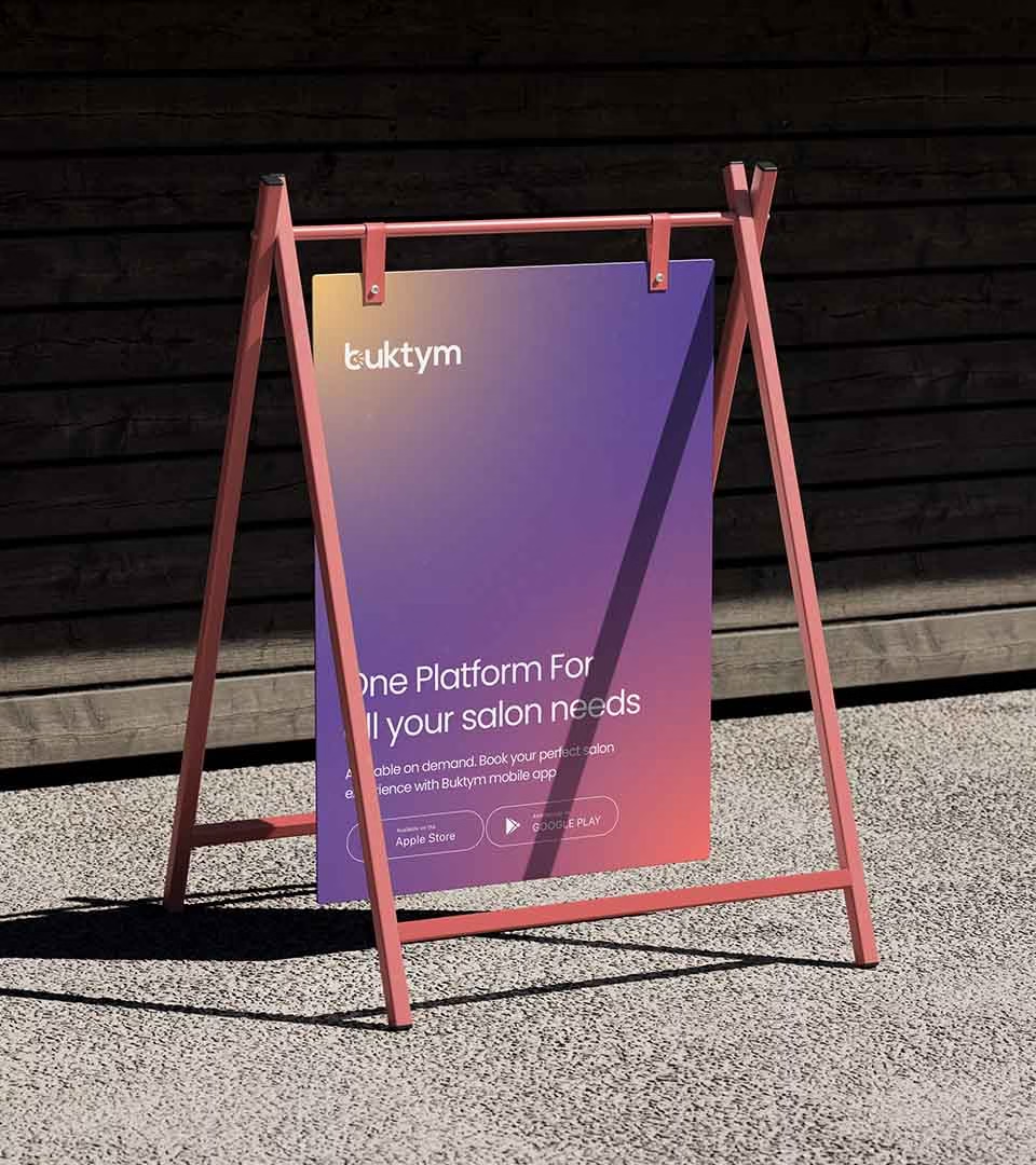
Buktym approached us to create a logo and branding that would easily convey their brand’s idea. The elements of time and booking needed to be incorporated into the design, and it had to be simple and easy to grasp.


Our Approach
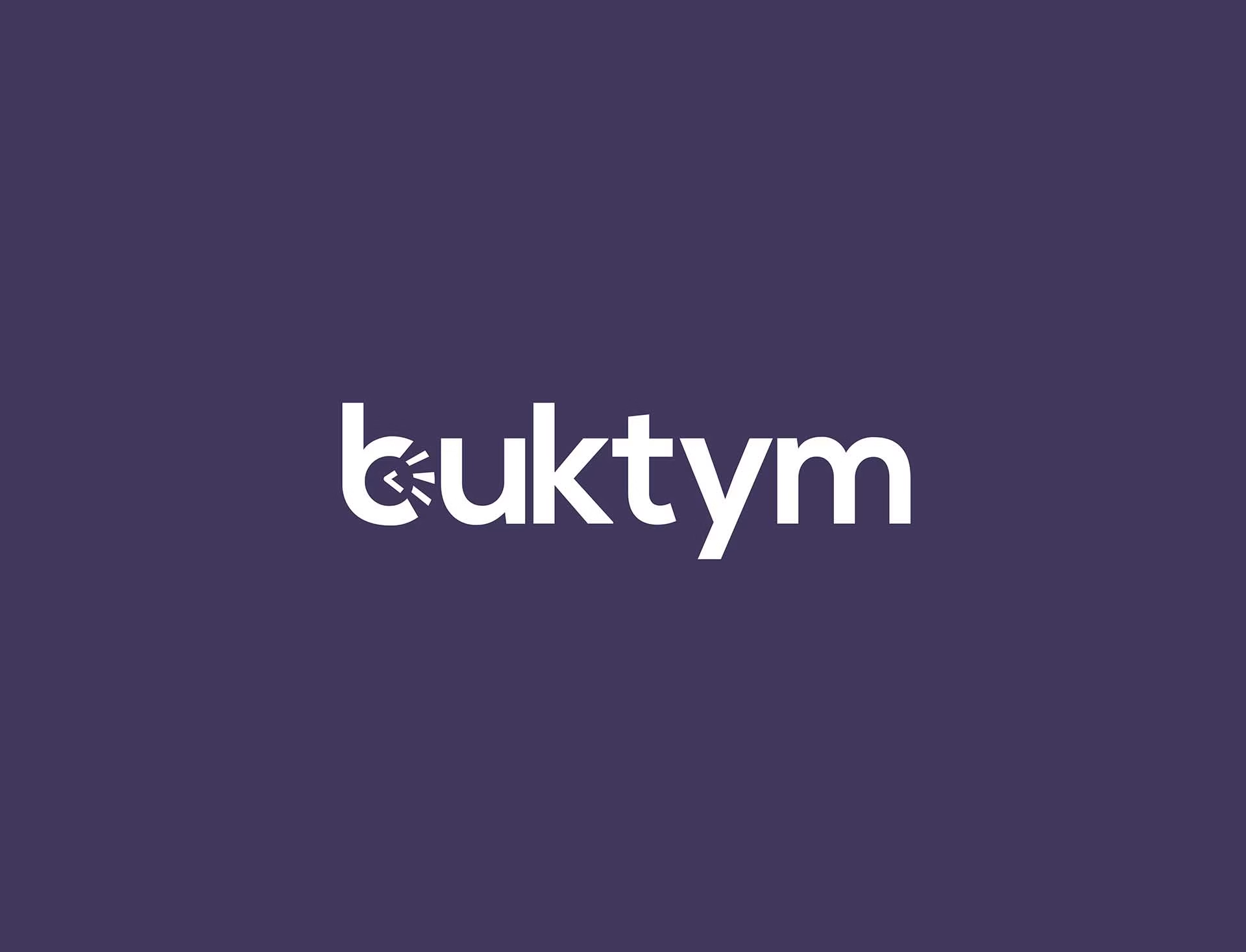
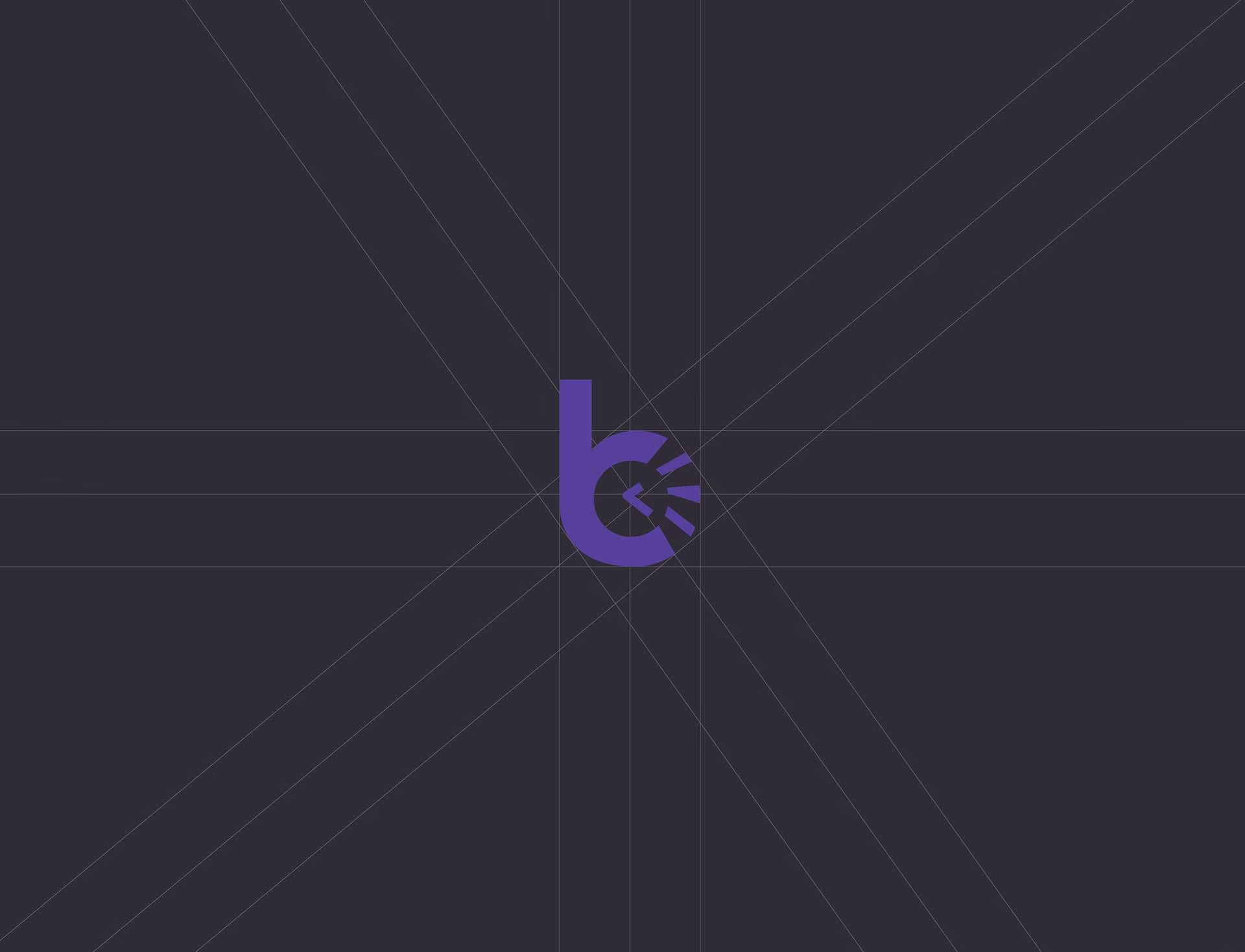
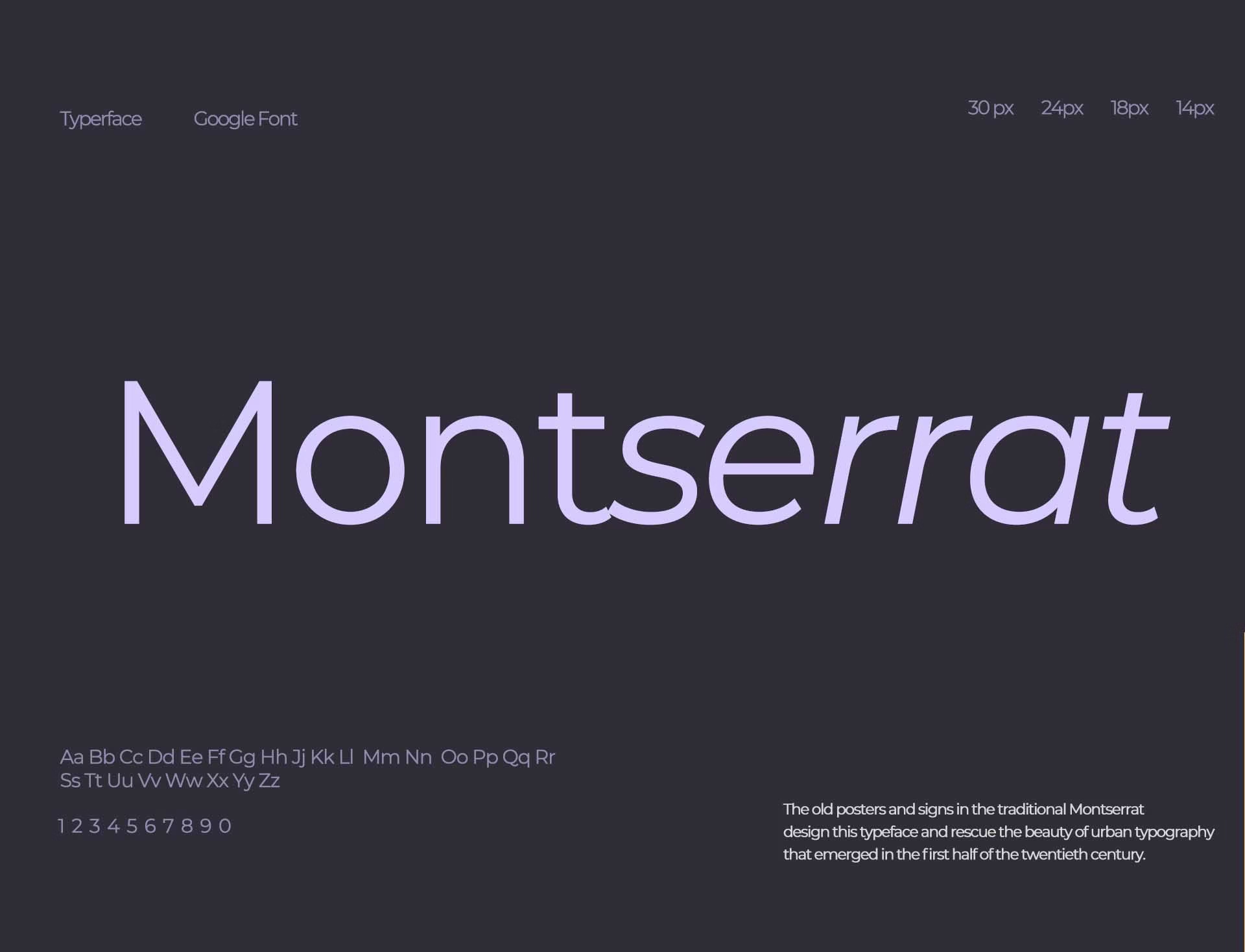
Since the brand was about leveling up from traditional practices, we thought it best that the logo should have a modern look and feel. To keep to a minimalistic theme, we followed a typography style and included the elements of booking and time into the design. We achieved this by infusing the element of a clock into the letter B, turning the name into a logo with a simple design tweak. Using a floral violet color in the logo, we set the brand color as well, which the team at Buktym really loved.

