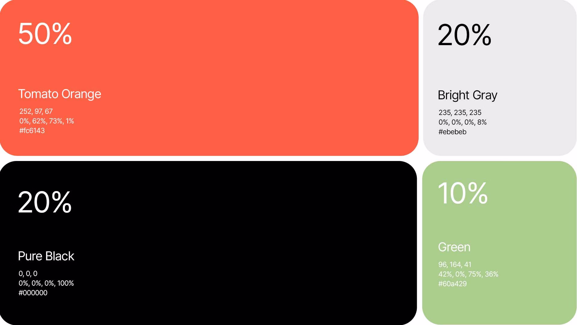
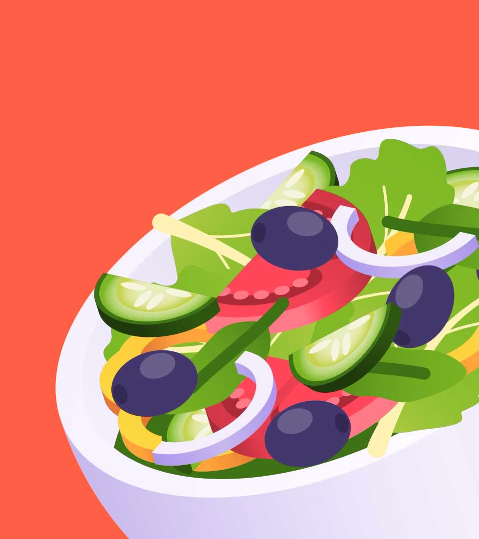
The bold combination of Tomato Orange, Pure Black, Green, and Bright Grey brings a sense of energy, freshness, and contrast—just like a well-plated meal. The colors work together to create a lively atmosphere that makes ordering food feel like an experience, not just a transaction.
Order Meal
A Flavorful Digital Identity
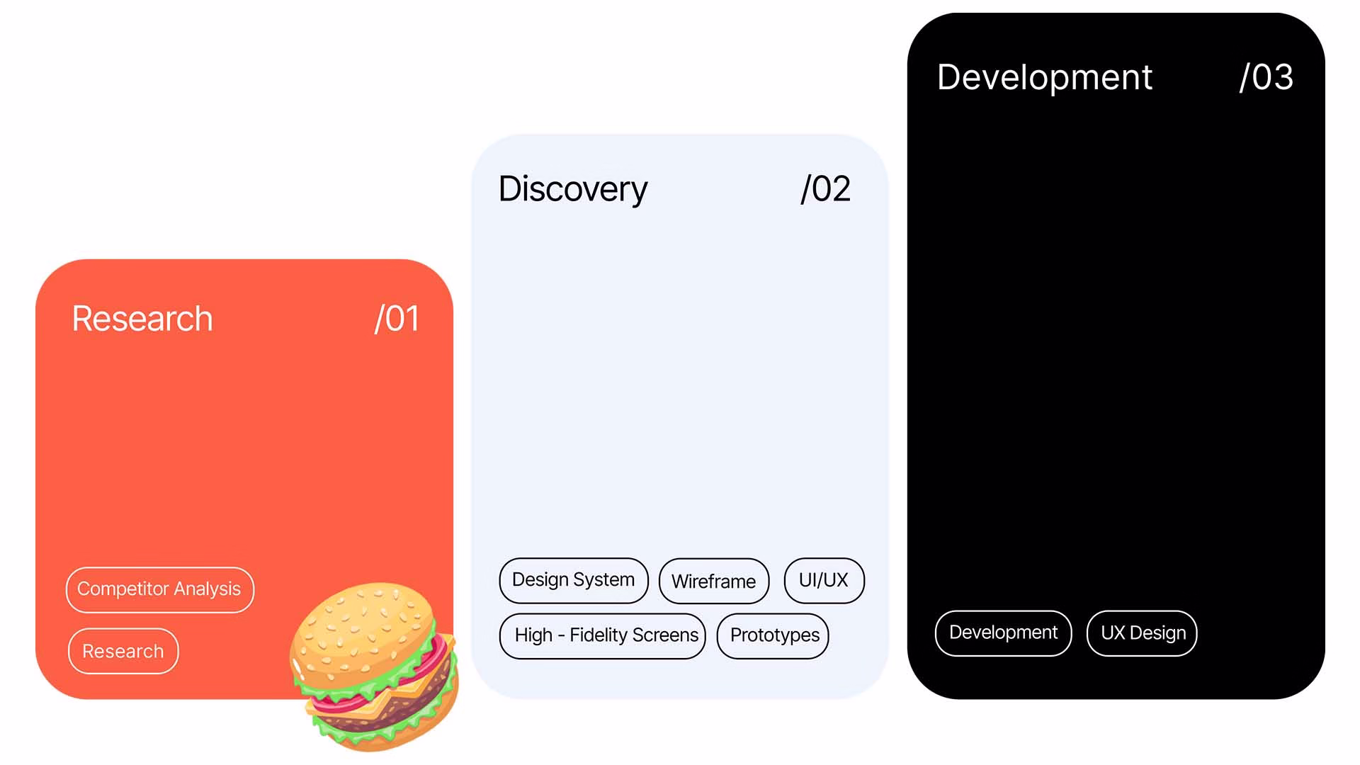
When crafting Order Meal’s brand identity, we knew it had to be as exciting as the dishes it serves.
Iconography
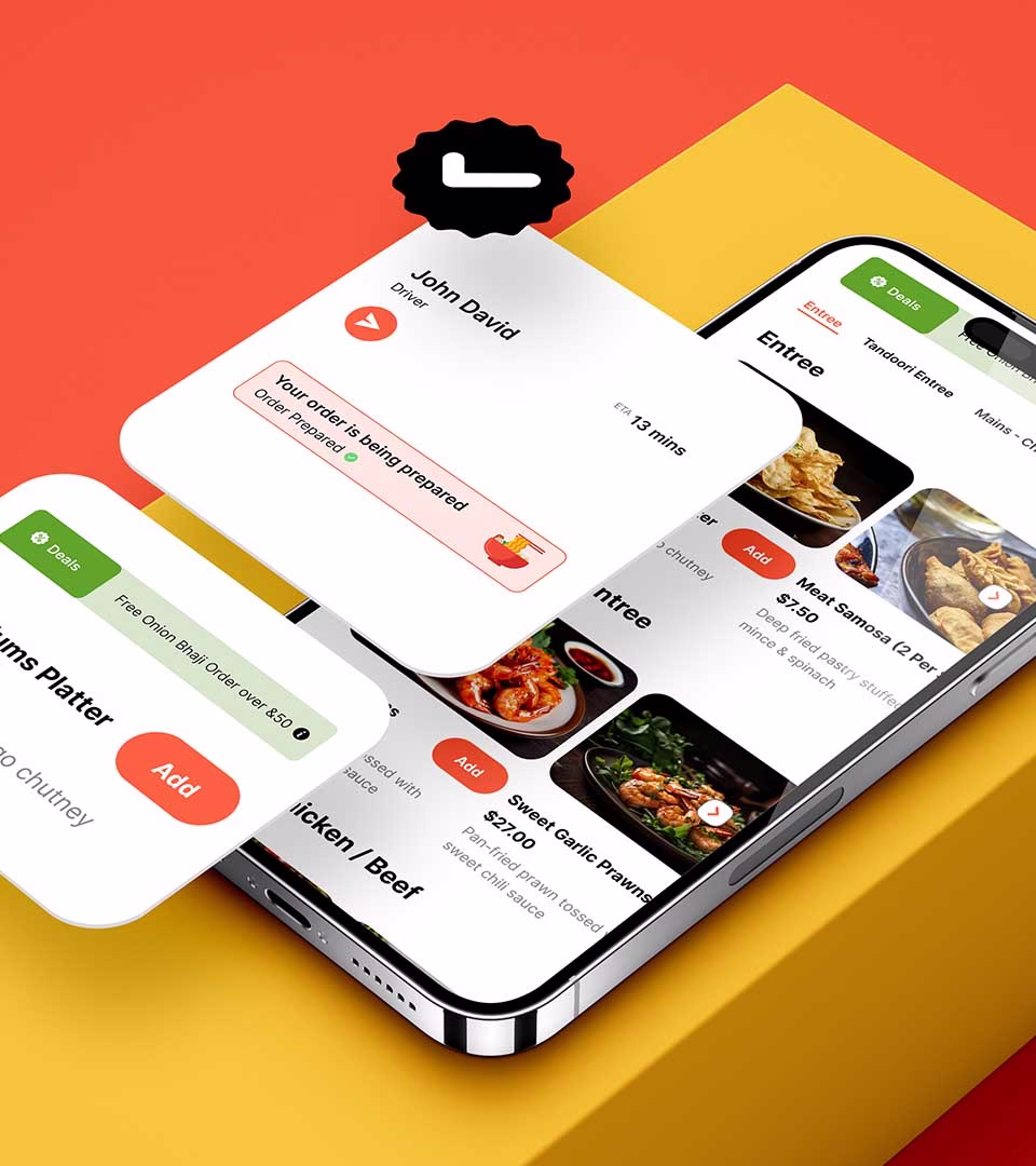
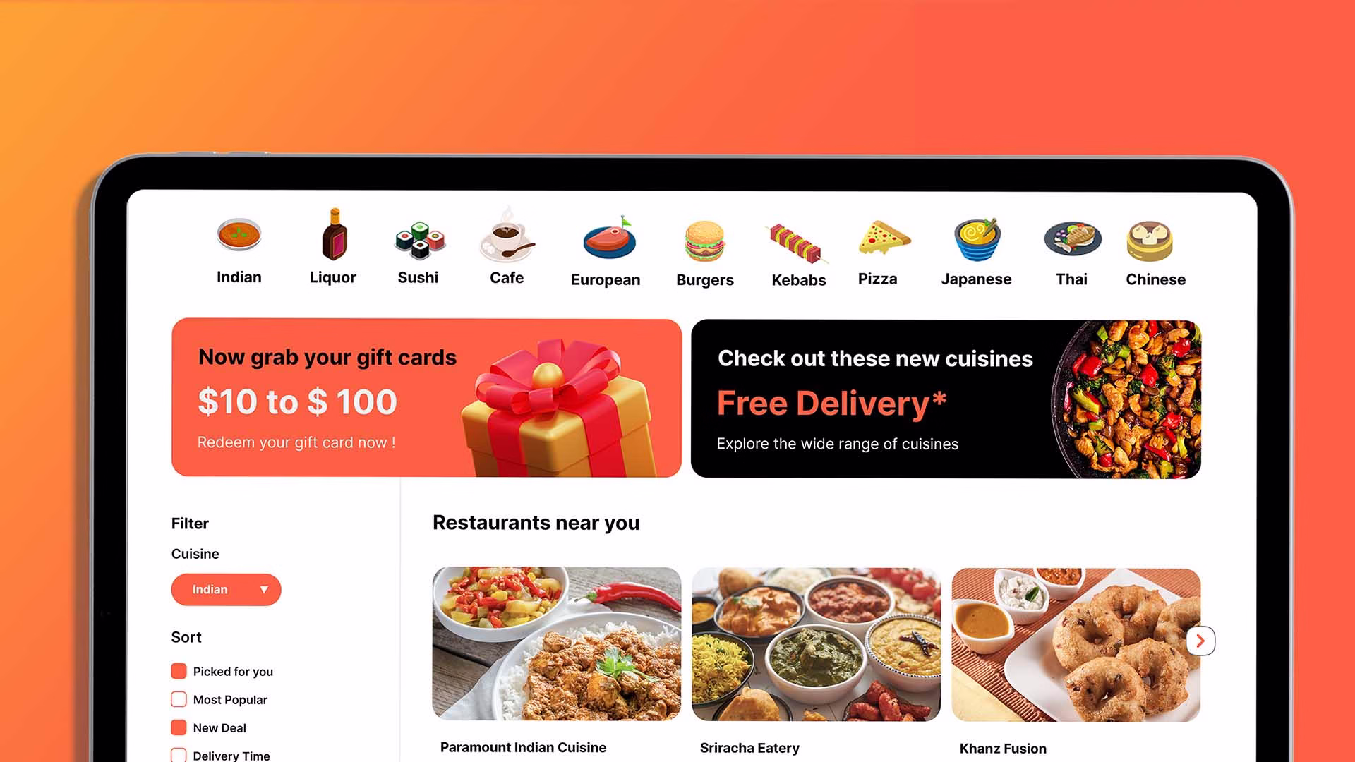
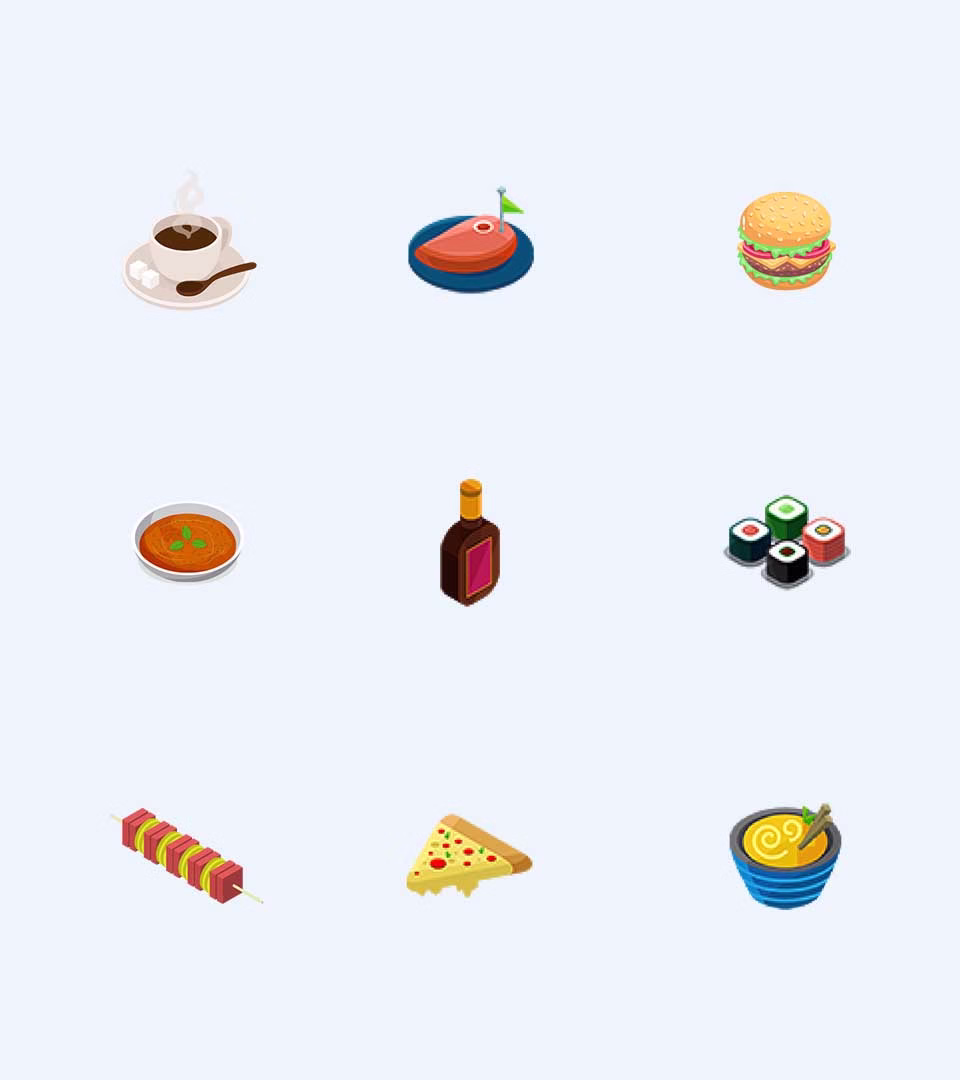
What’s a great food platform without a dash of fun? For Order Meal, we designed bite-sized food illustrations that add personality to the interface while maintaining clarity. Every icon serves a purpose—enhancing navigation, guiding the user’s journey, and making the entire ordering process feel intuitive and engaging. More than just aesthetics, these visual cues help customers make quick, informed choices at a glance.
Visual Harmony
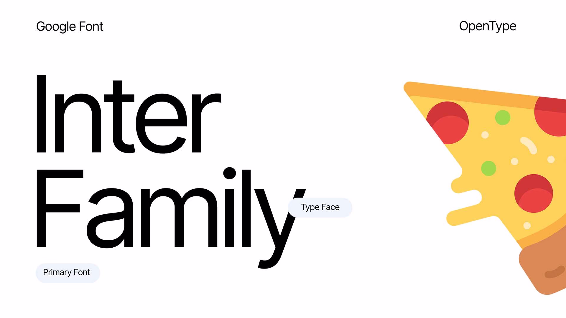
Designing a meal-ordering platform isn’t just about making things look good—it’s about creating an experience that feels right. We balanced bold typography with clean layouts, ensuring that every element has its place. The Inter font was chosen for its friendly, approachable style and high readability, ensuring seamless navigation across devices.
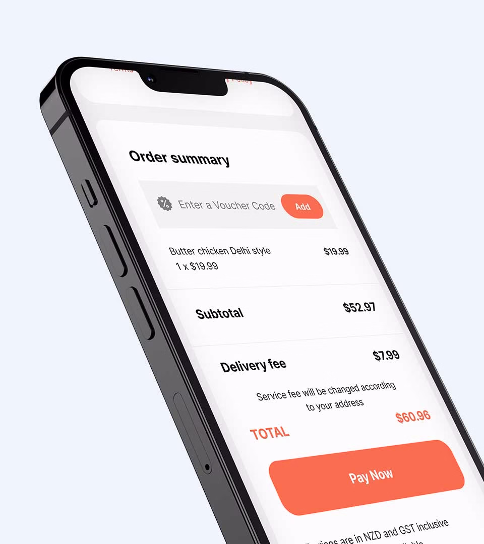
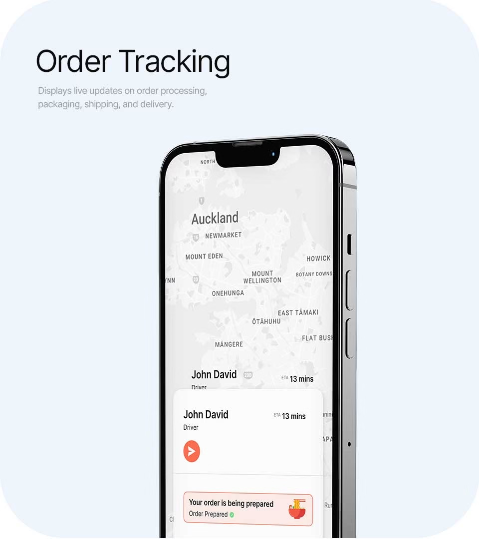
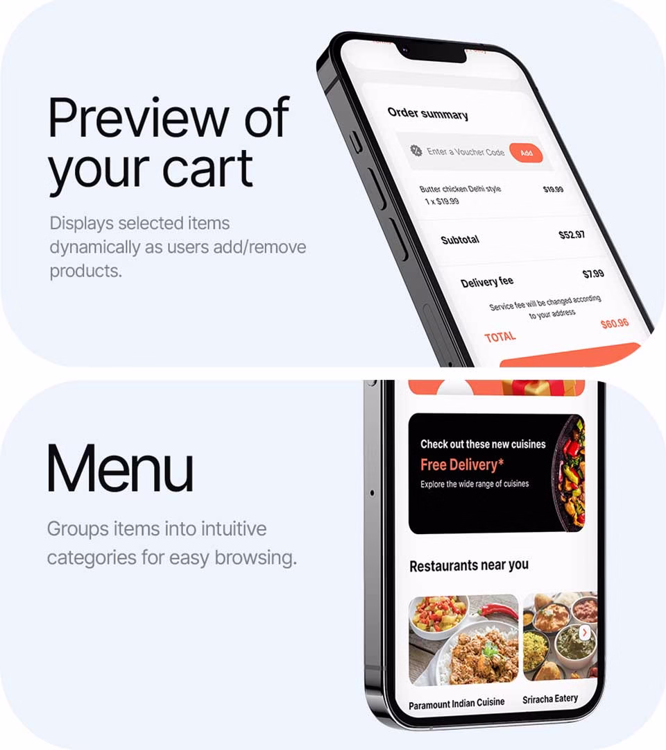
From browsing the menu to tracking an order, the Order Meal website ensures every interaction is smooth and delightful. It’s all about blending design and functionality in a way that feels effortless.
Bringing the Brand to Life
Beyond just a website, we created a digital extension of the Order Meal brand—one that speaks the same language as its food. Every color, font, and icon is intentional, reinforcing a brand identity that is fresh, inviting, and memorable.