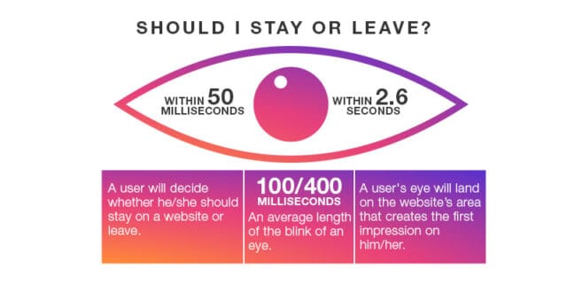
Studies say, “it takes about 50 milliseconds (which means around 0.05 seconds) for a person to determine whether he/she should stay on a website or leave.”

This means that all websites are subject to an utmost level of snap judgements that impact user thoughts within this fatal 0.05 seconds. Most of the time, this analysis goes beyond just beautiful design and engaging content. So, for a website, to make its visitors stay, it should satisfy the users’ initial requirements, as well as offer a convenient experience and straightforward functionality.
Is your website capable of doing that?
If not, don’t get worried, User Experience (UX) is achievable; it’s just about viewing your website as a customer and then transforming features accordingly. To help you out more on that, here’s a quick guide on how to create a user-friendly website, raise the user on-site time and enhance the bounce rate.
- Keep Things Speedy

‘Speed’ is an essential criterion that is considered for judging the user-friendliness of a website. If your website takes too much time to load, then you are sure to lose visitors.
According to a study by Google’s DoubleClick, “53% of mobile site visits were abandoned if a page took 3 seconds or more to load.” The same study also stated that “websites loading within 5 seconds had 70% longer sessions, 35% lower bounce rates, and 25% higher ad viewability than those taking nearly four times longer at 19 seconds.”
So, it is imperative to ensure that your website is capable of loading faster than a blink of an eye. You can use a Content Delivery Network (CDN), cache, plugins, etc. to increase website speed.
- Provide Simple Navigation

As a user can get multiple search results for any given search query over the Internet today, chances are high for them to leave your website and go for your rivals’, if he/she isn’t able to navigate through your site easily.
To evade any such situations, make sure to keep all menus intuitive and user-friendly. Never hide the main navigation menu options in the dropdowns; instead, keep them in a manner that is clearly visible for the user. Also, it is good to keep a user stay aware of what page he/she is on a particular moment.
Breadcrumbs can be helpful here, as they aid in better website navigation.
- Don’t Create Cluttered Content

Steve Krug, a renowned user experience expert, in one of his books ‘Don’t Make Me Think’ stated that “you make a user unhappy if you force them to think much”. This statement pretty much explains that unengaging content is a factor that leads people to decide between leaving a website within a short span of browsing through the site. Therefore, it is essential to provide content that is clutter-free as well as relevant to your visitors.
Try to use as much plain language as possible, and include headers, subheaders, and bullet points to make it effortless for your audience to skim the content. Avoid the usage of unwanted business jargons in the content – yes, you can use terms/phrases that indicate you are an expert in your domain, however, keep in mind that you are communicating first and foremost for your audience. So, make it understandable to them by all means.
- Make It Mobile-Friendly

As most users are now browsing via smartphones and tablets, you need to follow a mobile-first design approach while creating your website.
Not only search engines like Google will start crawling your website but also a mobile-friendly website will keep you from losing potential customers who check out your website on the go. Concerning the development of a mobile-optimized version of your website, it is recommended to hire experienced professionals from any renowned web development agency.
- Beef Up Your CTAs

Believe it or not – the majority of the users who visit your website wish to know what you want them to do on a specific page of the website. For instance, a website visitor who plans to register for your company’s newsletter needs to know what is the next step to be taken on the website. You can make such actions simple for users by using clear Call-To-Action (CTA) on the needed pages, in the clickable areas.
The kind of CTA your website has to feature will depend on the business you operate; however, if your website lacks the right one, your users will choose to go elsewhere!
Need more advice on crafting killer Call-to-Action? Talk to our experts now!
- Unified Style

According to surveys, most of the users admit to making observations on a business’ credibility based on its website design. This means that the credibility of any business is so intensely connected to its website’s aesthetic quality. So, to ensure your company’s reliability, your step one is to have a modern and engaging design that indirectly tells that your company truly minds about its digital presence. This includes implementing a unified style in terms of colours, fonts, ratio, layout, etc.
The design has to be cohesive so that your users won’t get confused between different pages of your website. For accomplishing these goals, you can formulate a guideline for maintaining the consistency of your website. Your mobile application should also follow these style guidelines. This way, with unique templates, brand-defining statements and images that keep users engaged, the high-quality aesthetics as well as the navigation capabilities of the website can be bolstered.
Want to know more about web design trends? Check our article: How We Design Website Layouts That Are Successful And Effective
- Pictures & Illustrations

“A picture is worth a thousand words” – this seems to be very accurate when it comes to website designs!
Using quality images and illustrations that fit your website theme and business domain, you can attract viewers’ attention. High-quality pictures and illustrations can also help users to have a better understanding of the text of your website.
All that being said, you also need to make sure that the images you choose won’t divert the user from the right objective of the website. For instance, an image slider might seem like a great idea, as it allows you to portray your business in multiple perspectives, or enables you to pitch a wide variety of offers; but, be informed, this is found to distract your users from what they were intended to do on your website. Also, certain studies have revealed that most users only spend around 5.94 seconds (on average) on the homepage image, and this means that users usually see only the first image in the slider.
- Testing

Just doing the right thing is not enough; measuring its effect is as crucial as doing it. We have not created a website for ourselves; so if you are using your website without any problems, it doesn’t mean that your potential users will work comfortably with it. Therefore, it is preferable to conduct user testing with the help of a professional website testing company to know whether the target audience understands the site or not.
Your web testing checklist should include functionality testing, usability testing, interface testing, compatibility testing, performance testing and security testing.
Let’s Conclude..!
Successful websites are all user-oriented at their core. If you help your customers address their dilemmas, they will love your website and repay you with business. Described above are a few fundamental ways to enhance your website’s UX design. These are things you need to understand before you hire a professional website UX agency. Building a user-friendly website requires planning, and some very professional help; being an expert web design and development company in Kochi, Parel Creative can provide you with the necessary support.
As we said, the impressions your website creates within 0.05 seconds do matter. To make them count, connect with us!


Thanks a lot for sharing this amazing blog with us. It is very helpful for me.
My family every time say that I am killing my time here on the web, however, I know I am getting knowledge everyday by reading the good content.