
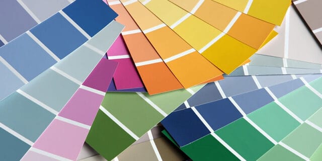
Did you know that colours can profoundly influence the UI of your mobile app! Using the right colours is not only about beautifying your app instead, it is also an elemental part of providing a better user experience where your users can navigate and use your mobile app painlessly. It can visually define the purpose and value of your brand and give your audience an idea of what your brand is all about. For instance, social media apps usually use bright and vivid colour schemes, whereas a meditation app would most preferably use neutral colours. Now you get the idea, right?
At Parel Creative, our decade long experience in UX/UI design has helped us consistently in delivering this perfect balance of visual appeal and functionality to various clients with differing needs. Explore more about us now!
Want to learn about the psychology of colours and its impact on the human mind? Here we are, with all you need to know! Let’s get started!
Why Is Colour Psychology Important For Mobile App Design?
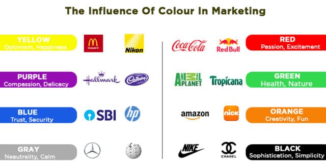
Colour psychology is basically the study of colours and how it affects and impacts the human behaviour and their emotions. Colour being a fundamental component of UI, makes it essential to incorporate the best choice that complements the overall design, leading to a higher number of downloads and more engaged users. Here is an example of how top brands used colours to communicate their values to their target audience.
The research by Institute for Color Research stated that “people make a subconscious judgment about a person, environment, or product within 90 seconds of initial viewing and that between 62% and 90% of that assessment is based on colour alone.” This does give us a hint about how colours are perceived as an important visual factor by the users. Not just this, there are numerous other researches and studies that dictate the extent of impact colour can create on human perception. Well, maybe that’s how our 6th sense works!
Key Principles To Select The Right Colour
You can not just adopt any colour palette for your mobile app. An app being used by many people needs to attain the perfect harmony of colours that enhances the mobile app functionality. So here are five key principles you should consider before moving forward with a colour palette.
1. Choose The Colour That Invokes The Desired Emotion
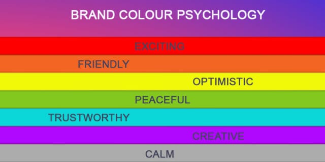
There are billions of colours in our world, and using suitable ones is essential for the success of your mobile app. Each colour denotes a different emotion, and so it is imperative to choose a colour that most resonates with the emotions you want to evoke in your visitors. An appropriate colour palette for your mobile app will put your prospect in the right emotion, either consciously or unconsciously. For most people, yellow signals happiness, orange is for fun, red is for speed and energy, blue is for trust and possibilities, while green signifies wealth. Here’s a graphic that demonstrates how a colour is associated with a brand.
While you choose a colour palette for your mobile app, it is necessary to know your audience as various colours may symbolise different emotions in different cultures. For example, red might be associated with energy in one culture but danger in another. So select colours that prove to be meaningful for your target audience instead of going with a generalised approach.
2. Check The Colours Your Competitors Use In The App Stores
An intense competitor check is always good before moving forward with your colour palette. It’s not to copy the design; instead, view it as an opportunity to learn about the trends and traditions following a specific industry. Reviews about your competitor’s mobile apps can also teach you a lot about what works and what doesn’t work in your niche. Competitor analysis is, in fact, the key to make your designs stand out from the rest.

Note that whatever colour scheme you choose after your research, it should be easy on the eyes, creating a sense of depth and dimension to the design just like how the neuromorphic details in UI work- subtle yet powerful.
3. Add The Fourth C Of Mobile App Design
There are always some set of rules that you ought to follow everywhere, and that’s the case with mobile app design as well. Known as the 3-C’s-rule of design, it stands for Consistency, Clarity, and Content and is an essential part of choosing the colour palette.
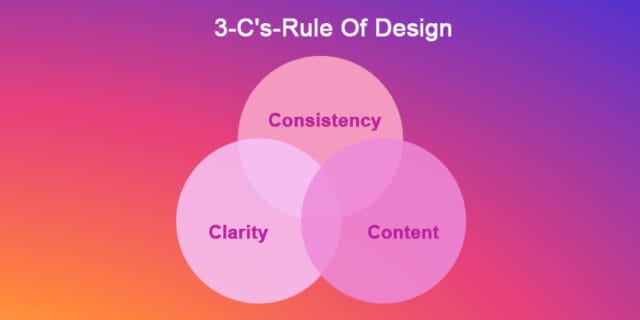
But there’s one more ‘C’ that you should consider following too, the C for Colour. It is one of the prominent visual elements capable of creating a distinct emotional connection apart from greatly impacting the readability, usability and overall success of the design.
And you don’t need a lot of colours to build an impressive design; rather, just a couple of colours can do wonders for you. Two or three colours with their dark and light variations are enough to create your colour palette.
Also, another quick colour theory to follow here is the 6:3:1 rule. Here you have to choose a dominant colour to be used in 60% of the mobile app, a secondary colour to be used 30%, and an accent colour to be used in the remaining 10% of the design. Consider this as a great starting point in building your best colour palette that’s supportive of content and functionalities.
4. Start With The Basics
Starting with the basics makes you less prone to mistakes and acts as a great foundation to build your design step by step. With respect to colours, a crucial yet fundamental element is the UI hierarchy, based on which you have to distribute the colours of your colour palette. You can easily achieve the perfect balance in the visual hierarchy by employing the right kind of colour, contrast, bold, etc. Try to come up with a fresh new idea from the existing design rules to create something unique and distinct.

5. Don’t Be Afraid To Break The Rules
You may be tempted to follow the rules already in existence and followed by many, but to incorporate uniqueness, you need to break the design rules creatively. That’s where the magic happens. Whatever colour scheme you select for your mobile app, make sure it has a solid reason as to why you went for this certain colour palette. Don’t just create something out of this world; rather, have a clear vision about how effectively you can convey your message through the colours and then tweak it till you are satisfied with the palette. For example, Google’s new app icons have adopted a colour scheme involving many colours as opposed to the popular notion of using fewer colours, but nevertheless, they have maintained consistency throughout their app icons aiming to retain visibility and strengthen the brand.
In the design world, you never know what can become trending until you are prone to intelligent experimentations.
How To Find A Suitable Colour Scheme For Your Mobile App?
With so many colour choices, you might get a little doubtful about selecting the most admiring colour palette. However, a colour palette should not only be attractive but something that will help in enhancing the brand and its marketing strategies while increasing the performance of the mobile app. The right colour scheme will ensure your app is easy to use and interpret.
Today there are many pre-made colour schemes or colour palettes available that you can use without any effort. But remember, you can always tweak those colours to come up with your own version. Think about which colour most effectively represents your brand, the impression it would have on the users and then gradually start developing from there.
Here are some ideas to get you started!
- Minimal colour usage by adopting a focused colour palette.
- Increase visibility using high-contrast colours in UI.
- Incorporate less noticeable or subtle coloured shadows.
- Try bright colour iconography.
- Go for a pastel or muted colour palette.
- Create a colour scheme by limiting your choice to white, black, and grey.
- Try the trending high-contrast, complimentary gradients.
- Get artistic with colourful illustrations.
Getting The Colours Right!
Communicating with colours may seem silly, but it’s how we can create an impact on a subconscious level. It’s also how you can be a step ahead of your competitors. Many a time, the right colours incorporated is how we add value to the informative content of a customer-oriented mobile app.
Struggling to come up with a perfect mobile app design? At Parel Creative, the best web design and development company in Kochi and Singapore, we have crafted delightful experiences for hundreds of companies and brands from around every corner of the world. We are happy to help you out as well! Connect with us now!
Our wide range of digital services includes web design, mobile app design, interaction design, prototyping and various other services aimed at creating a flawless web solution for our clients. Find out more!


the very nice article was very informative and helpful. Thanks for sharing such a knowledgeful article.
meal kit delivery services market