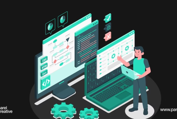
The internet is ruled by millions of websites, and designing it pretty isn’t the best way of creating a website. Today designers have to look beyond aesthetics and develop websites that provide enough importance to the website’s usability. Such websites are well-coded, load faster, and have better UI, which in turn can fetch you a wider audience reach and a better website performance.
When you launch your website to the world of the internet, you have to make sure that your website is easy to use while providing an excellent user experience. Your visitors should not just merely scroll through the website; instead, aim to create an impact by transforming your website into something people would enjoy interacting with. Although you can get a lot of tips on this, but to get started, we have compiled eight essential fundamental guidelines for designing a flawless website.
Before that, we are here to help you create a website that serves your business goals. Parel Creative, the best web design and development company in India and Singapore, has been providing outstanding web design services to prominent clients from around the world, and this has enabled us to take on any kind of project. Our expertise in web design will deliver you custom solutions to fit exactly your requirements and goals. Find out more!
Now let’s get started!
1. Simplicity
Simplicity has consistently scored high when it comes to web design and is undoubtedly one of the most important factors to consider. Most people come to a site with a specific purpose, such as taking an action or finding some information. Therefore, ensuring that those purposes are fulfilled is vital for a website’s success. Stay away from including unnecessary design elements that can make things worse or complex for your audience.
Tip: Limit the use of colours to a maximum of 5. Typefaces should be selected on the basis of how legible it is to read. Aim for a highly-legible font type. Here as well, use a maximum of three different type fonts; along with that, don’t forget to pick a colour that contrasts with the background colour. For graphics, use it only if it helps the user to complete the task and not just for the sake of adding it.
2. Visual Hierarchy
Visual hierarchy deals with the arrangement and organisation of different website elements in a way that makes it easy for the visitors to differentiate between the important elements and the less important ones. Implementing visual hierarchy in your website design will help your visitors lead through the website to complete the desired action in a natural way.
You can work with visual hierarchy by adjusting the position, colour, or size of certain elements in a manner that can draw the attention of your visitors to certain elements first.
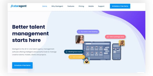
Below is an example of how StarAgent model agency management software implemented the visual hierarchy of using a big, bold headline to convey the idea straight to their website visitors. The headline is then followed by a sub-copy and a CTA button that is simple and clear.
3. Navigability
To navigate efficiently through your website, you need to plan and apply intuitive navigation to help them find what they are searching for. It should not let your visitors think too much about where to click next. The moves should be as effortless as possible, or else there is a great chance of them leaving your website. To do that, keep your main labels and location of your navigation the same on every page. It also helps in bringing consistency to the design.
Here are some more valuable tips for optimising your site navigation.
- Incorporate a simple primary navigation bar and try to place it near the top of your page. Also, you can include it in the footer of your site as well.
- Use breadcrumbs for all your web pages.
- Add a search bar at the top of the site.
- Don’t have too much navigation, or it will become complex to apprehend.
- Make your page copy links clear to understand.
4. Consistency
Consistency can play a major role in creating a positive impact on the usability and UX of your website. Besides keeping your navigation consistent, you have to keep colours, typefaces, backgrounds, tone of your writing, etc., similar across all of your site’s pages. Every page should look like a part of the home page. Although the layout of all your pages should look consistent, you can also create different layouts for specific types of pages.
For example, our website uses this same principle to showcase different service pages. But on the other hand, the home page uses a different layout.
Similarly, Airbnb uses the same layout for all its ‘Help’ pages because using a different layout for every help page can make everything harder to understand while ruining the usability and UX of the website.
5. Responsivity
According to research by ‘Hubspot‘, 93% of people left a website because of not displaying the website properly on their device. And this is why you need to make your design responsive, meaning to make your site compatible with different devices. It is one of the key players in truly increasing your user experience.
A responsive website is highly flexible in nature; that is, it can automatically adjust to the dimensions of the device your visitors are using. You can accomplish this either with mobile-friendly HTML templates or by developing a special mobile site. Alongside, it’s worth testing your website’s responsiveness on different browsers such as Google Chrome, Safari, Firefox, etc. Open your website on different devices and browsers and evaluate how your website elements are appearing, and then make the smart move to keep it all good.
6. Accessibility
You create a website not for yourself but for others, and among those others are people with disabilities or limitations. These limitations affect their browsing experience. So the purpose of incorporating web accessibility is to make a website that anyone in the world can use.

Accessibility is, however, not confined to one element; rather, it applies to the whole site elements such as structure, page formats, visuals, content and more.
According to Web Content Accessibility Guidelines (WCAG), developed by the Web Accessibility Initiative and the World Wide Web Consortium, the websites should be:
- Perceivable: Visitors are easily able to perceive the content on your site.
- Operable: The website’s functionality should be possible in several ways.
- Understandable: Everything that’s on your website is easy to understand.
- Robust: Your website is compatible with different assistive technologies, devices, and browsers.
7. Conventionality
We all await an opportunity to implement our out of the box thinking without realising the importance of thinking creatively inside the box. And similar is the case with web design as well. While we thrive on creating unique websites breaking the customs and conventions, it does come at a cost. And that cost might be things like a frustrated visitor.
We have always seen some of the conventions being implemented onto the websites, such as placing the main navigation at the top, having a clickable logo that brings back the visitor to the homepage, having links that change colour and so on. While it can seem very alluring to throw these conventions out, that’s not how it works. Remember, there’s always room for creative ideas that can be implemented within the constraints of web conventionality while following these guidelines to develop a flawless website.
8. Credibility
Sticking to web conventions also helps in building credibility to the website. And that happens because of the great user experience that comes along with the conventions. Apart from design, credibility also depends a lot on how trustworthy your content is. For example, if you provide a false product description, it can result in a negative impact, while if you are clear and honest about the product, then the credibility improves.
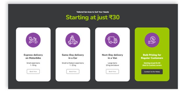
Another useful tip is to link and provide your very important content on the homepage instead of forcing them to contact you for more details. Doing so makes businesses appear more legitimate. To get a clear idea, here’s an example of an effective pricing page created by our web designers for the Aladdin express delivery service.
Best Practices for Exceptional Web Design
Since you are now aware of the best practices for a better web design let us consider some more important rules to follow.
- Go for a typography that’s easy to read and skim.
- Be particular about choosing a colour scheme and select something that matches your brand personality.
- Use white space to avoid crowding between different elements.
- Use texture to add depth.
- Use visuals to engage and inform readers.
- Simplify your navigation so people can easily move through your website.
- Make your CTAs stand out.
- Optimise for smartphones and other devices.
- Limit the options presented to users.
Levelling Up Your Web Design!
Your website represents your company and its values, and therefore is necessary to appeal to your target audience in order to create an impact. Keeping in mind the UX principles can be a key cornerstone in creating a website where your visitors feel excited and accomplished.
Another efficient way is to take the seat of your website visitors and evaluate it by yourself. This can open up a lot of creative ways on how to improve the usability of the website and make it more user friendly.
So that’s it for now! Consider all these tips and tricks, and you will be on your way to building a great website with impressive features. Meanwhile, you can always trust us to get professional web design services. Get connected with us to get started!