Ever noticed how you can recognize a Netflix show title from across the room, even before reading it? Or how luxury fashion brands consistently use certain types of lettering that just feel expensive? That’s not coincidence – it’s the subtle power of typography at work. In today’s visual-first world, your brand’s typography is doing more heavy lifting than you might think.
Beyond the Surface: Typography as Your Brand’s Voice
Think of typography as your brand’s accent – it’s not just what you say, but how you say it. When tech giant Apple switched to San Francisco font across its devices, it wasn’t merely a design choice. It was a statement about clarity, modernity, and user-centric design that perfectly aligned with their brand values.
Typography is like your brand’s body language. Long before someone reads what you’re saying, they’re subconsciously judging how you’re saying it. When Airbnb unveiled its custom-designed Cereal font family, it wasn’t just about looking good – it was about expressing their core value of belonging anywhere through every single letter.
The Psychology Behind the Letters
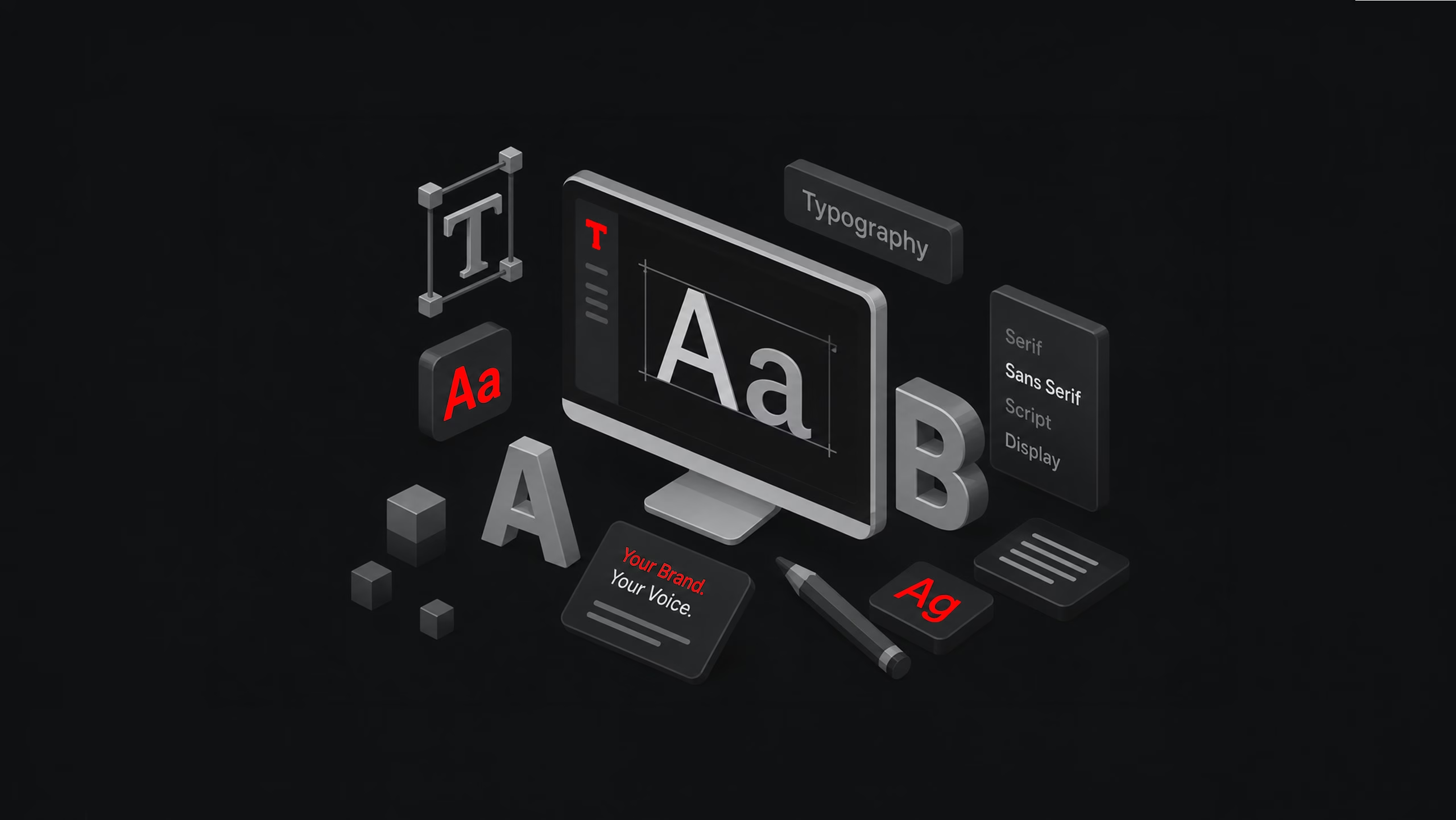
Every font family tells its own story. Take Serif fonts, like Times New Roman – they stand tall with their decorative feet, carrying centuries of editorial heritage. These traditional letterforms instantly communicate authority and credibility, which is why you’ll often find them gracing the websites of law firms and academic institutions.
Sans-Serif fonts, on the other hand, strip away the decorative elements for a cleaner, more contemporary feel. When Facebook rebranded its corporate identity using a custom Sans-Serif typeface, it wasn’t just following a trend – it was reinforcing its image as a modern, accessible platform.
Imagine a boutique patisserie or a wedding planning service. Script fonts add that personal touch, suggesting handcrafted quality and individual attention. However, like a signature fragrance, they should be used thoughtfully to maintain their impact.
Display fonts are your attention-grabbers, perfect for headlines and logos that need to make a statement. But like any powerful tool, they require careful handling – too much can overwhelm your audience.
Consistency: The Key to Recognition
In today’s omnichannel world, your brand exists across countless touchpoints. Whether someone’s visiting your website, scrolling through your social media, or holding your business card, consistent typography creates a thread of recognition. It’s why you can recognize a Nike advertisement even before seeing the swoosh, or why Google’s clean, friendly typeface feels familiar across all its products.
In a world where your brand needs to look good on everything from a billboard to a smartwatch, typography is your secret weapon.
The Power of Typographic Logos
Some of the world’s most recognizable brands rely solely on typography to make their mark. Look at IBM’s solid, striped letterforms, or FedEx’s clever use of negative space. These logos prove that sometimes, letters alone can carry the weight of an entire brand identity.
The Bottom Line
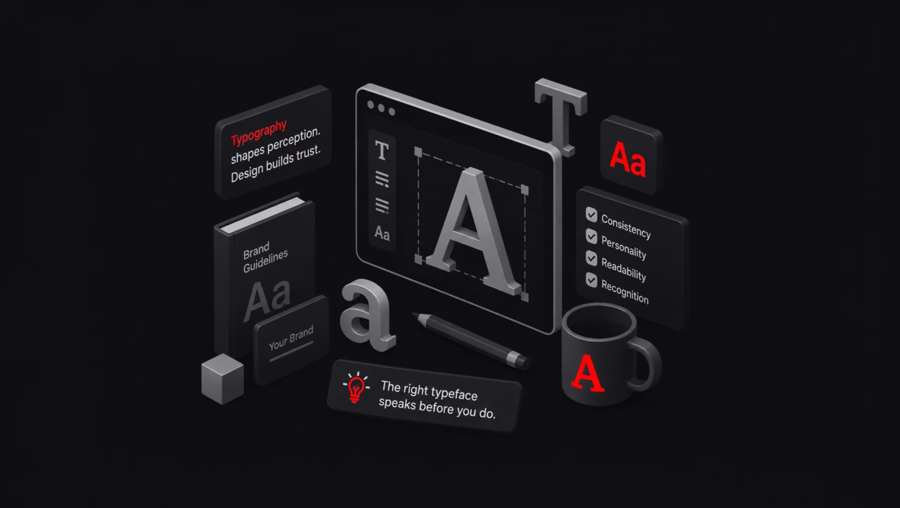
Typography isn’t just about selecting a font from a dropdown menu. Here’s the kicker: Every font choice is a micro-moment of branding. Every letter, every space, and every curve is either building your brand’s personality or confusing it.
Remember: Your brand’s typography is having conversations with your audience even when you’re not around. Make sure it’s saying what you want it to say.
Great brands know that the right typography speaks volumes. At Parel Creative, we help your brand find its voice through purposeful typography and strategic design. Want your typography to tell a stronger story? Reach out to us!