

Picking a branding agency is harder than it should be. Portfolios are easy to make look good. The real question is whether the thinking behind the work actually matches what each client does and who they’re talking to. A few projects that show what that looks like across different industries.
Why Strategy Leads Design
Good branding starts with understanding what a business actually needs to communicate, and to whom. The visual direction comes after that, not before.
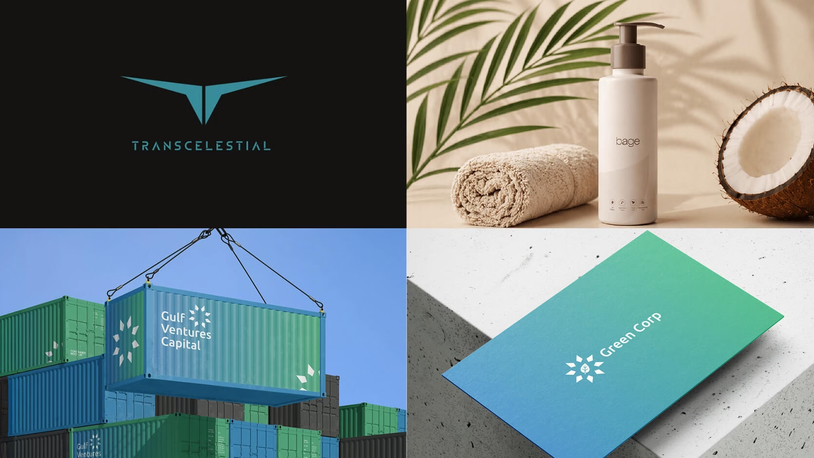
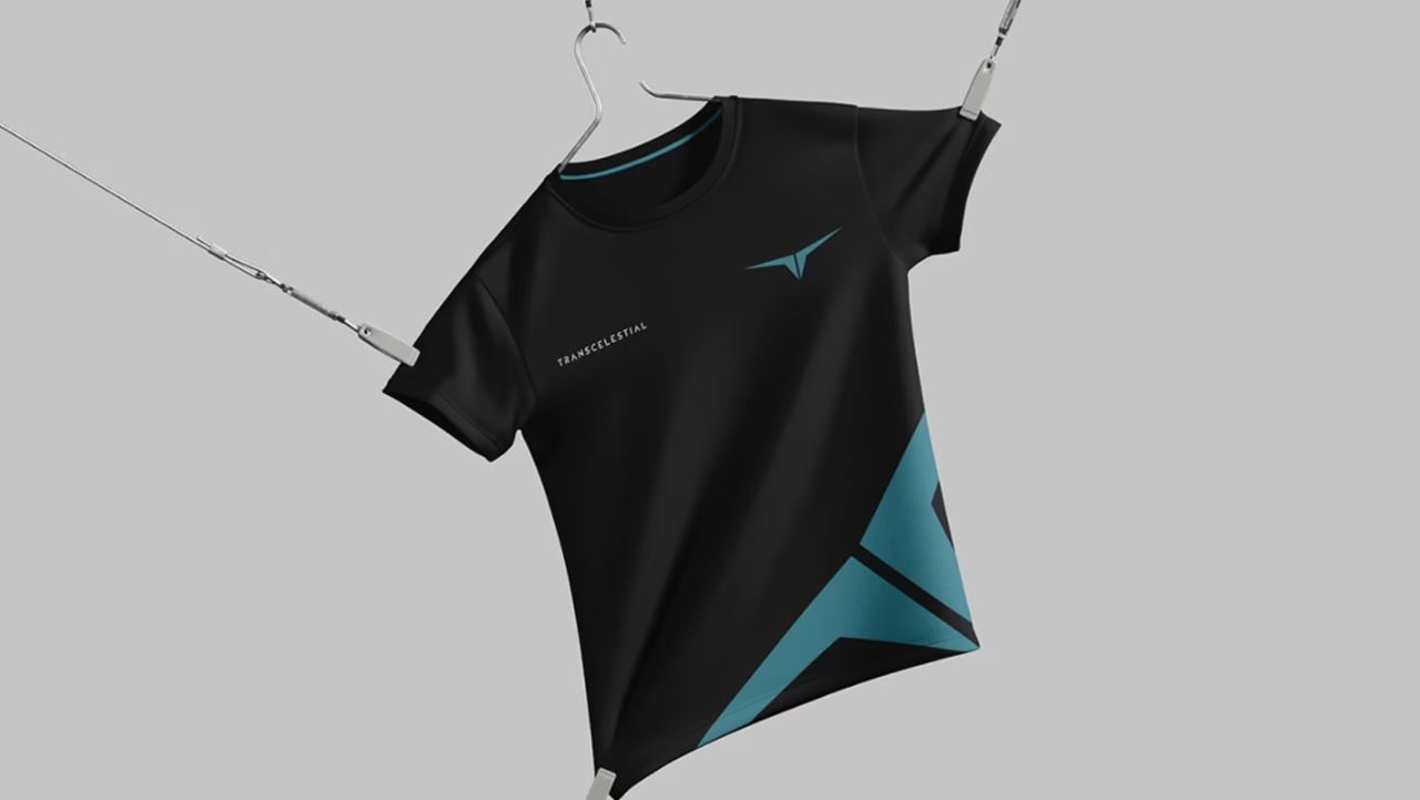
Take Transcelestial, a Singapore-based company building wireless laser communication technology. The brief was to give a genuinely ambitious connectivity company the kind of brand presence that matches the scale of what they’re building. That meant a bold visual identity and a digital experience that feels confident and forward-moving without getting lost in technical detail.
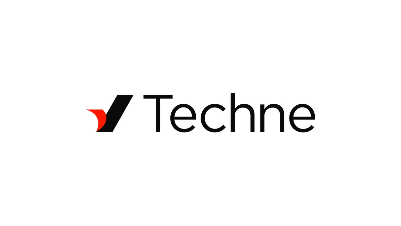
Then look at Techne, a Vertical AI venture platform focused on the hospitality and travel industry. Here the priority is instant credibility. The design system needs to communicate that this is a serious fund with deep sector conviction — not a startup homepage, but a platform that institutional-level stakeholders will take seriously.
Two different briefs, two completely different directions.
When the brand has to carry meaning, not just look good
Some projects are mostly about identity, making sure the brand feels right for the space it operates in.
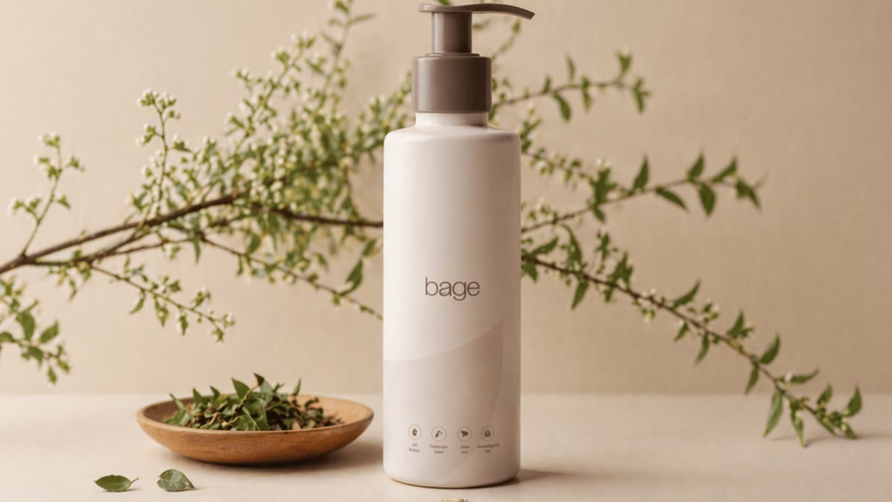
Bage is a premium skincare brand that formulates traditional Indian botanical ingredients into safe, fast-absorbing products for modern daily use. The brand lives in the space of quiet luxury: minimal, tactile, factually transparent. The design needed to carry that restraint without feeling cold, and the premium quality without feeling indulgent.
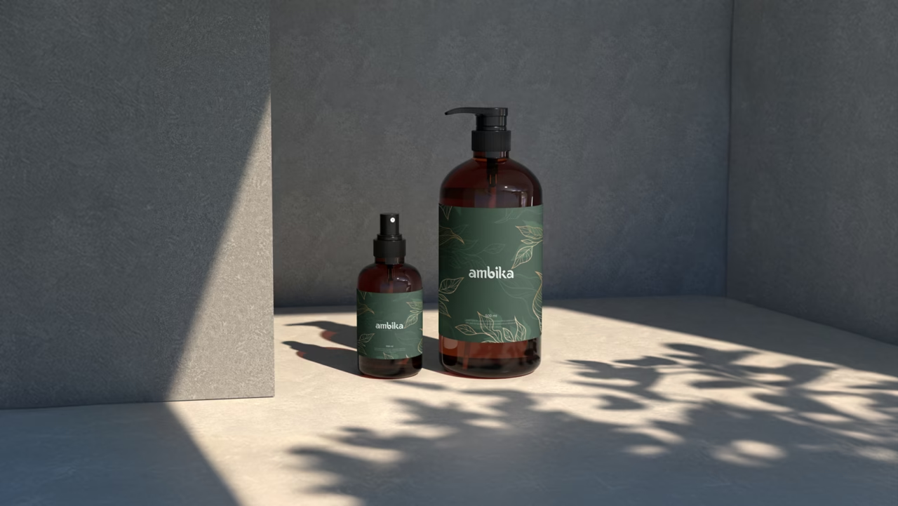
Ambika is an Ayurvedic wellness product brand. The design needs to feel rooted in tradition without looking dated. Clean, modern shelf presence, but with warmth and authenticity that generic wellness branding usually strips out.
These aren’t complicated briefs on paper. Getting them right is harder than it looks.
Industry-specific credibility
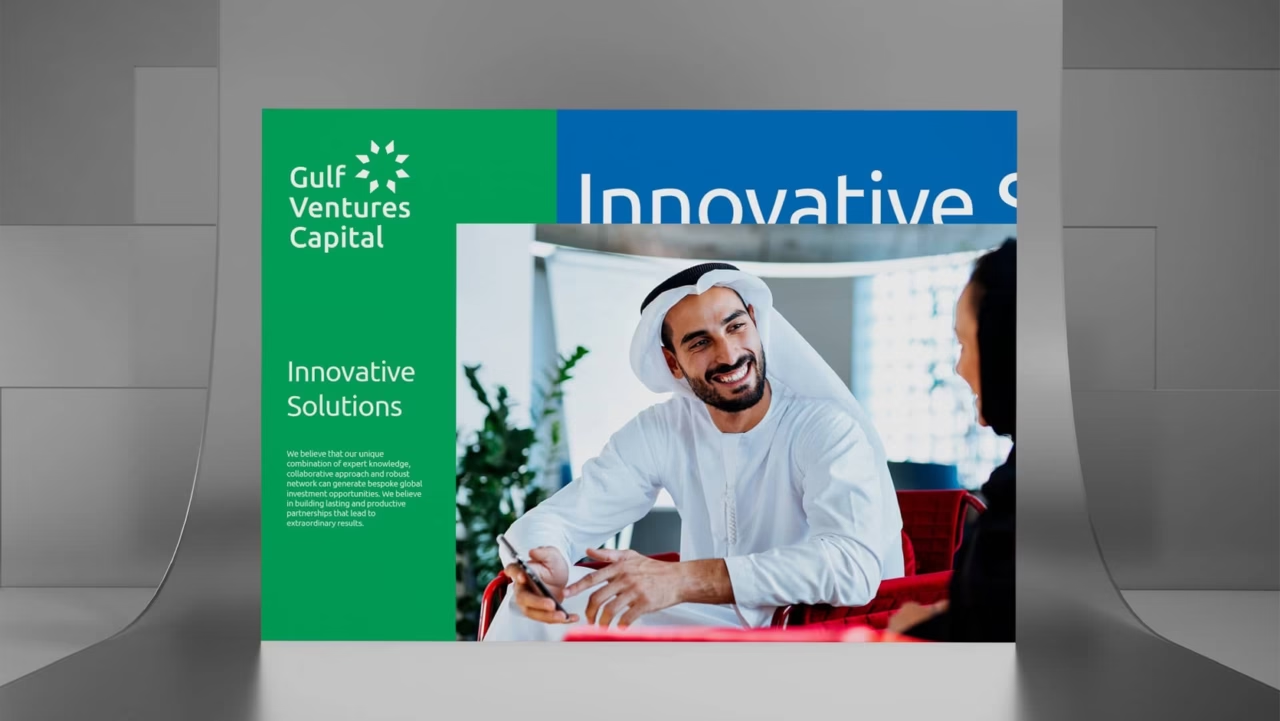
Gulf Ventures Capital is a Bahrain-based subsidiary of Gulf Islamic Investments, one of the leading Shariah-compliant alternative investment firms in the GCC. The brand needed to reflect institutional authority without feeling cold or generic, the kind of identity that earns trust before anyone reads the copy.
Salamander Advisory is a tech-focused advisory firm. The design is clean, direct, and structured — built to communicate credibility to a discerning professional audience without any visual noise getting in the way.
Green Corp is a different kind of seriousness. They’re working on agricultural innovation and food security for the GCC — a genuinely ambitious mission that spans farming technology, sustainability, and regional impact. The identity needed to carry both the environmental story and the scale of what they’re building.

Precision as a design brief
Vinton is a premium architectural metalworks firm that engineers complex, custom-built metal structures for top-tier architects and luxury developers. The brand needs to reflect the exactness of what they actually do. The visual identity had to match that level of craft: refined, confident, nothing wasted.
What to actually look for in an agency
When you’re evaluating branding work, a few things are worth checking.
Does the visual language change meaningfully between clients, or does every portfolio piece look like it came from the same template? Is there evidence the agency understood the business, not just the aesthetic? And is the work actually out in the world, on live websites and real products, or does it only exist as a presentation?
Those are the questions worth asking. We’re happy to walk you through how we approach them. Explore our full portfolio at Parel Creative.